The Project & Processes
The the main goal for the project was to improve the conversion rate for RSI. They wanted more bookings with more consistency. Prior to working with Rally School Ireland on their website. They invested in a business consultant that helped them define who their customers are and what they wanted. This research gave us clear idea of who the target audience was. For our internal research, we focused on how to optimise conversions and how we could refine the product. As part of that we needed to understand what the pain points were and how we could make the sales funnel as frictionless as possible.
One clear take away from the client research was that the majority of the bookings for driving experiences came from individuals purchasing an experience for their partner. Predominantly female customers buying an experience for a husband, boyfriend, brother or son. These purchases accounted for 62% of the individual sales. This meant that the website user is predominantly female however they weren't necessarily going to be the end user going on the experience.
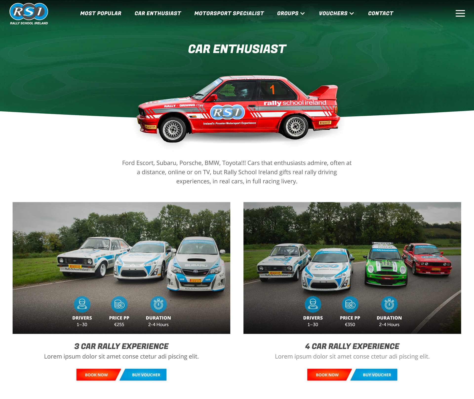
While testing on the old RSI site we observed users struggled to choose an experience. They felt that there were too many experiences to choose between and were worried that they'd make the wrong choice. Buying a voucher is always an option but we wanted fix the problem. The choice overload overwhelmed the users. To resolve this issue we worked with the RSI team to group the experiences into tiered categories with a card sorting exercise. Each category is based on a user persona and the users car competency. This tactic allowed us create specific landing pages for each persona. With a maximum of seven experiences to choose from. This step made the decision making process much easier for the users and refined the product offering.
Research
Our research time was spent on refining the product offering as the user research & SWAT analysis had been provided. During testing of the old website, users had 18 different experiences on page to choose between. Which lead to choice overload. We felt this lead to less conversions as user went elsewhere. Now that we had defined the challenge, we went about solving it.
Concept & Wireframes
I started with a sitemap to get the conversation going.
This consisted of a standard online shopping sales funnel. Once this was agreed up I started creating an interactive wireframe to test our concept. The wires included the persona based landing pages. Which the users understood and navigated to as they were tech savvy and have a clear mental modal of online shopping. With the wires arppoved and signed off, we moved onto the design phase.
Design & High Fidelity Prototype
The design phase starts with creating 2-3 homepage concepts to pitch to the client. During the pitch meeting I reference the wires through out as clients can sometimes get a little lost. It can also help avoid scope creep. Then once a direction has been chosen. I'll build out a few core pages for the second round pitch. This usually results in a few changes as the stakeholder has a better grasp of where the project is. I will then update the designs based on feedback with the aim of having a high fidelity prototype to test before developer handover.
Testing
For testing we bring our users back to see how they interact with the new design. During the testing phase we will usually start to receive copy and image changes. Which results in us going back a phase to make minor users tweaks before going to build.